Can anyone believe it is October already? Not only that, but we’re already a third of the way though it! In Australia, and in Melbourne to be exact, the temperature is going up, and we are really coming out of the winter doldrums. This Spring for us has started off with a warm bang, with some really unseasonable warmth. It is a nice change, but so much warmth so soon does not give me much confidence for a nice summer ahead. Hang on, this isn’t a weather blog! This is my design blog! What the heck Adam!
Sorry about that. This blog update is jam-packed full of goodies, so be sure to read on! I have had some really good wins in terms of finishing things these past 2 months, and am really looking forward to showing everyone these items. I have branched out a bit from my normal goings-on and am still hard at work doing stuff so hopefully people get a kick out of looking at what I’ve got.
2015 FORMULA 1 RACE WEEKEND/SEASON REVIEW
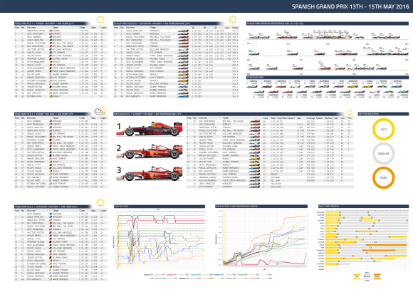
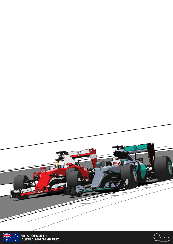
So this has been an ongoing project of mine since basically the start of the year. The idea of this project is that I would do a race review of each Formula 1 race in the 2015 season, looking a lot like this:
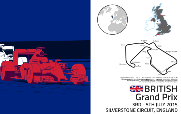
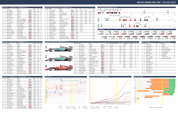
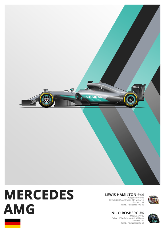
The race reviews would include a whole hap of info from across the weekend,including practice times, qualifying results, and race strategies. The trouble with finally getting on to these was the finilisation of the pixellated side views of each team in the season. Now they are all finished!
All 10 teams have now been finished in their pixellated glory! See below for each team and a final group image!
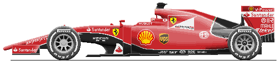
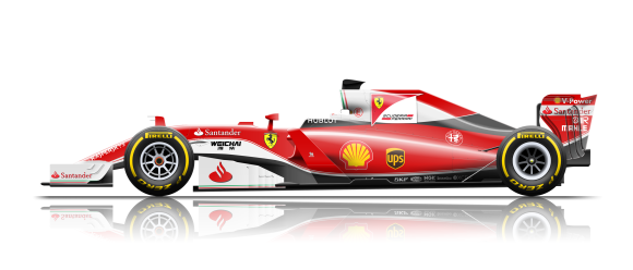
Ferrari SF-15 T
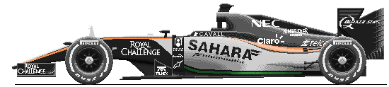
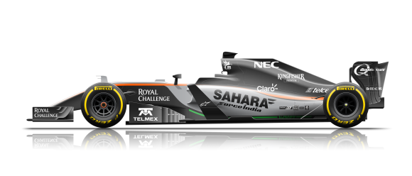
Force India Mercedes VJM08B
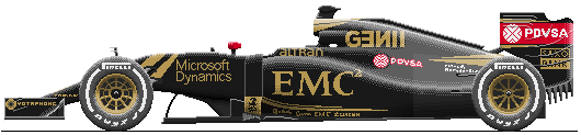
Lotus Mercedes E23 Hybrid
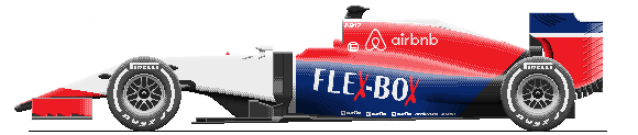
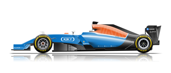
Manor Marussia Ferrari MR03B
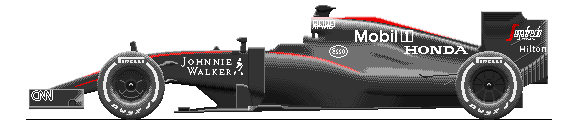
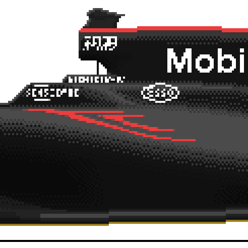
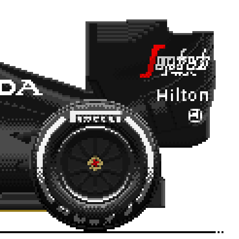
McLaren Honda MP4-30
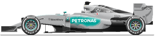
Mercedes F1 W06 Hybrid
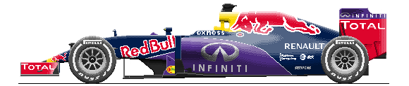
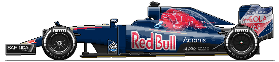
Red Bull Renault RB11
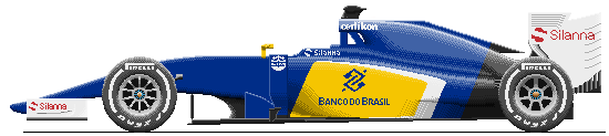
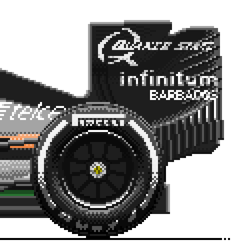
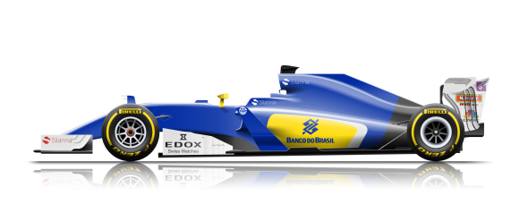
Sauber Ferrari C34
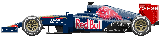
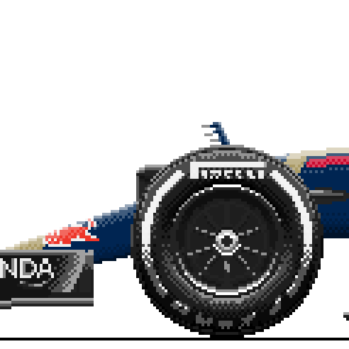
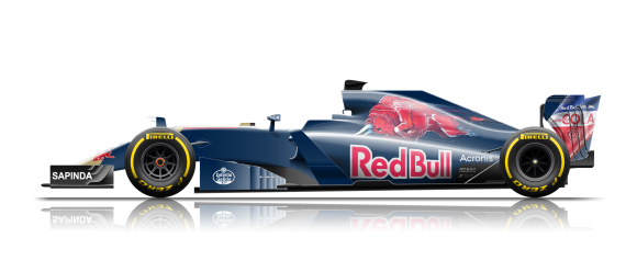
Scuderia Toro Rosso STR10
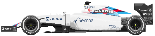
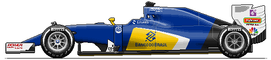
Williams Mercedes FW37
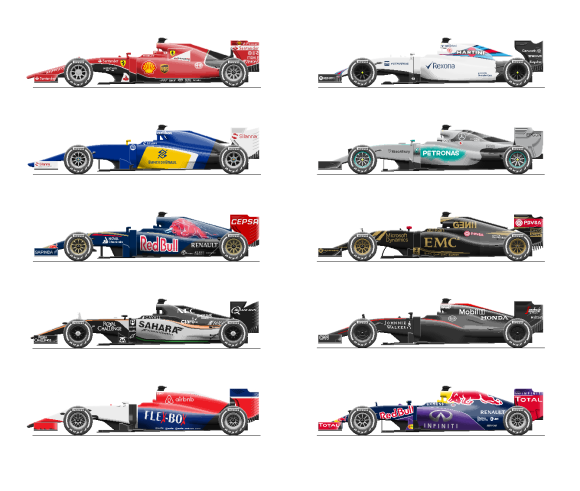
All 10 2015 Formula 1 season teams
A little bit a bout the process:
- I usually gather high resolution images of each car that show the right details I need. I will study the cars to assess where the bumps, lines and reflections sit and try and assess where shading is required and what shapes need to be shown correctly.
- The basic shape of the car is developed based on the images I obtain using a single colour. This part is fairly easy it is basically a silhouette as shading gives definition to the form of the car in reality. Unpainted carbon fibre parts are given their own colour.
- I then start putting on the shading and reflections. The entire car is made of the 3 shades of black and 3 shades of white at different opacities. By painting each shade on top of each other, I get a much brighter or darker shade. To provide a ‘fade’ effect, I utilise an effect called dithering, where the shade is alternated to give the appearance of a different colour. This practice is quite common in pixel art work. All the different parts of the car (the flow conditioners on the side, front wing endplates, sidepods, etc.) come to life with the shading.
- After the form of the car is provided by the shading, I then apply the car livery underneath the shading using the team colours and the design of the livery at the time I developed the car. I try to be as faithful to the car livery design as I possibly can, such as with the Toro Rosso car (one of my favourites!). Once the colour goes on, I apply the sponsor and tech partner decals by basically painting scaling the actual logos and painting over them with solid colours.
- Voilà! Car is done!
I am very happy with the results and am very happy to have completed all the cars. These will now go into the Race Review pages and will really make them really complete, and will also allow me to finish up the rest of the races!
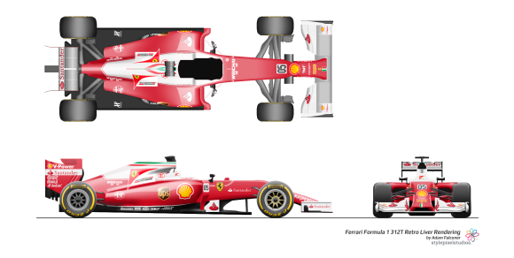
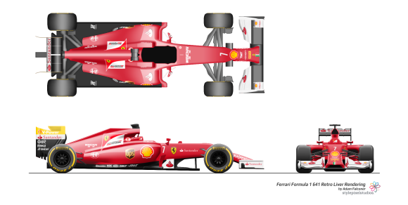
FERRARI FORMULA 1 RETRO LIVERY
I recently (earlier this year) developed Ferrari retro liveries for their F14T Formula 1 car. The results are below:
Since then, I have got together and developed an official Behance submission or my portfolio! Check it out here!
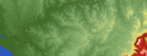
MELBOURNE EASTERN TOPOGRAPHY
One of the things besides Motorsport and the Weather, I am interested in Geography, and more specifically Geography and mapping of elevation changes. I really look in awe to mountains and undulating landscapes, and how the surface of the world has been shaped over thousands and thousands of years. The energy needed to develop mountains, and subsequently erode them down, or even how a river can carve a valley out of rock.
I discovered a website called FloodMap. The website is actually a tool to show that, in the event the sea levels rose to a certain amount, which parts of the world will be underwater. In reality, the code works that you input an elevation, and it will provide a shaded area of all parts of the land that are at and below that elevation. This turns out to be an excellent tool to research and record elevation changes in certain areas!
Being a Melbourne local, I had always been very interested in how the geological makeup of the city was. In Melbourne, there are low mountain ranges that basically surround the city, with the eastern ranges being a bit higher that the northern and north-western ranges. In the eastern part of the city, the land is much more hilly, culminating with the 600+m Mount Dandenong, which can be seen from the city centre. Not very impressive for most I am sure, but I was curious how the land changed as one travelled east towards that mountain an towards the eastern ranges. It is a bit hard to see through the houses and buildings!
So, I gathered the data from FloodMap and set the elevation interval at 10 metres. I chose the following area of Melbourne to conduct my investigation:
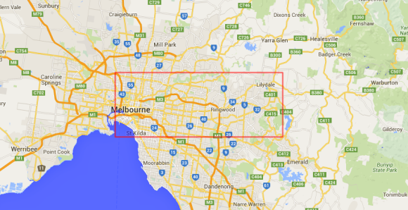
This way, I could have a look at how the elevation changes as you go due east as the crow flies towards the eastern ranges.
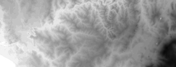
I developed each elevation area by taking the data from FloodMap and filling each region in Photoshop. Tedious, time consuming, but the easiest and quickest method at my disposal. The results are as follows (and be sure to click to get a better image!):
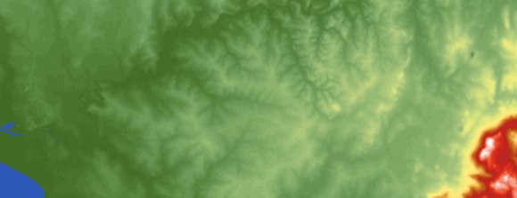
Shaded elevation profile, interval = 10m. Dark green is at sea level, white is at approx 620m. The yellow is at about 120-130m. North is up.
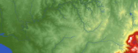
Shaded elevation profile, interval = 10m. Major rivers shown from source as provided by GoogleMaps. The Yarra river is the river that flows to the west into the larger areas of water and flows from the top middle area.
Shaded elevation profile, interval = 10m. Each elevation interval is shown in black at 5% opacity
Shaded elevation profile, interval = 10m. Countour lines shown
Firstly, how cool are the results? secondly, the results show the Mount Dandenong are quite a bit higher than the rest of the eastern area of Melbourne. There are plenty of valleys an gulleys for rivers that flow into the Yarra river, but interestingly many of those rivers have their sources in the raised yellow area in the middle-right of the image. It is interesting that there is a small range forward of Mount Dandenong (shown in the white region) that rises above the rest. In fact, the ground actually flattens quite a bit between these ranges and Mount Dandenong itself. I find this remarkable, and am curious as to how this has come about, and why.
All in all though, I think it is a really awesome way to look at the world around you. I would love to do more of these if they weren’t so time consuming! I would to do a large Map of Melbourne fully, including western and northern areas, just to see how the ranges that surround the city have developed as one gets closer to the city. I would also love to have a go at implementing some shading to give that 3D effect you might see on GoogleMaps Terrain, but that again would take some time. Maybe in the future!
DISNEYLAND TRIP 2015 LOGO
We are going on a trip to Disneyland and Las Vegas in January 2016, and I had been tasked to develop a logo for us that we might be able to put on T-shirts for us to wear while we are there. You know the t-shirts that tour groups wear, or families wear? Yeah, those! With 7 of us going it might come in handy to be able to identify each other in the crowds, and will make for a nice memento for the trip. This rip is fairly significant for many of those going so it might be nice to have something to remember it by (besides all the awesome times we will be having!).
The logo so far looks like this:
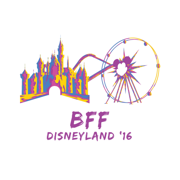
It is a little lacking at the moment, but the whole idea of the logo is that it focuses on the main point of the trip: Disneyland. I didn’t want to make it too complicated (by adding in characters in scenes, for example) but wanted to show something that was very Disneyland – the castle, and Mickey;s Fun Wheel at Disneyland California Adventure. The Disneyland castle is shown prominently, with the fun wheel shwon next to it, portraying Disneyland’s two most iconic sights. The use of purples, pinks, blues and yellows provides an exciting element to the design, giving a vibrancy and fun side, which Disneyland is all about. The ‘BFF’ is what we are calling the trip, not because we are BEST FRIEND FOREVER!! but because it is a coming together of all our surnames. I might see what I can do with the font but we’ll see how we go.
GVH AEROSPACE
The company I work for during the day specialises in Engineering services and consulting, including in the area of aerospace design and development. Employees were invited to try their hand at developing an identity for a new company that would incorporate many other companies that were doing mostly the same thing across the world. The company would be called GVH Aerospace.
The company would mainly provide aerospace design and aerospace project management services on a global scale, and would be able to provide approvals and development for a number of clients from Australia to the UK. From the onset, the company would be professional, dynamic, but also and most importantly, global.
I tried my hand and didn’t hear anything for a while. Earlier this year I was told that my idea had been chosen! Woo! Now at work, I see it everywhere!
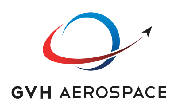

TTo really hammer the global aspect home, the logo features a prominent blue ‘Earth’ with an aircraft-like object ‘swooshing’ around the ‘Earth’, as if encompassing a large area of the world. This signifies the idea that GVH Aerospace has a lot of the world covered for aerospace engineering services. The use of red and blue relate to the parent company, but also help define what is the earth and what is GVH Aerospace.
But, why GVH Aerospace? The ‘G’ comes from the prefix for aircraft registered in the UK (i.e. G-XXXX), and the ‘VH’ comes from the prefix from Australian registered aircraft (i.e. VH-XXX). Put the two together, and you get GVH Aerospace!
Rockin’
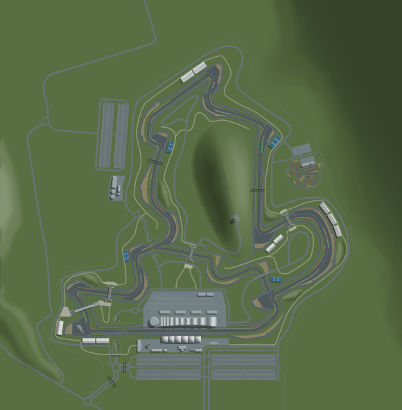
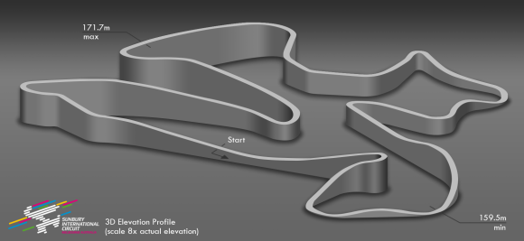
MOTOR RACING CIRCUITS
Given all of the above, I have not been able tot ouch on the Sunbury International Circuit much at all. I am however making it my goal to work on this for most of the next 2 months. The things I want to get done are:
- Develop final design of the main grandstand
- Develop design for the pit building and pit complex
- Develop and finalise circuit layout including all ancillary items (access, grandstand, etc.)
- Develop models for rFactor version of the circuit
- Develop final simulation model of the circuit
Bob;s Track Builder is what I currently use for developing the circuit for rFactor, however the developer of BTB is also working on a more advanced version called RaceTrackBuilder. This will be able to import circuits to much nicer looking modern simulators such as Assetto Corsa. Given this, I have made it my goal to get a copy of this game (probably on a new laptop) and develop SIC for this game, providing a much more realistic look at the circuit.
In other racing circuit news, my other racing circuit, the Motukarara International Circuit, recently won a ‘1,000 Subscribers Competition’ in the RaceTrackDesigns Subreddit. The circuit gained almost 20% of the vote, and I am super stoked it won! I put a lot of effort into it and tried out a couple of new things, especially in how I presented the final circuit, so I am so happy that the circuit won and my efforts paid off! No monetary reward, just pride 🙂
IN THE NEAR FUTURE
In the next couple of months leading up the Christmas, I am going to be concentrating on the following:
- Sunbury International Circuit: Finishing this project off! Building design, layout design, putting it all into the simulation, it’s all happening! I also really want to develop a noise analysis as a means of showing the how the location of the circuit works in it’s favour.
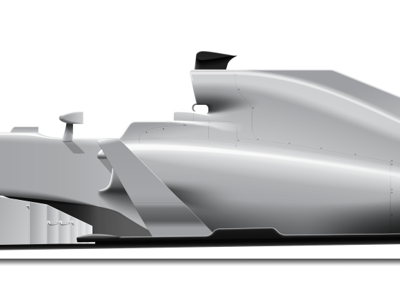
- Race Car Design: I alluded to this in my last blog post, but I really want to get a race car design going. Something that looks fantastic, has the right proportions, has great safety, fast and has great performance. This is mainly in response to criticisms of Formula 1 being unexciting, with the cars becoming somewhat neutered in the last couple of years, and still find hard to follow another car during racing conditions. It is also spurred on by the likes of the Red Bull X2010/x2011/x2014, and by other submissions for future F1 cars. Expect the design to concentrate on aerodynamics and how to remove the reliance on front end aerodynamics (somehow)
- Airline branding: This is something I have wanted to look at doing for some time, but I always find something else to do! This is the design of an airline identity, most likely a mid-cost carrier like Virgin Australia that will fly both domestically and internationally. I decied to call it Australiair, as in, Australi-air, mixing ‘Australia’, and, well, ‘air’.
- Formula 1 Race Reviews: Having now finished the cars, I can now start developing the rest fo the 2015 Formula 1 race reviews! Hopefully I can get them done before season 2016 starts next year!
That’s it from me this time around! I can be reached via email at adam@stylepixelstudios.com, on Facebook at facebook.com/stylepixelstudios, or on Twitter at @Stylepixstudios. Love hearing from you all, so feel free to give me a buzz!
Until next time!


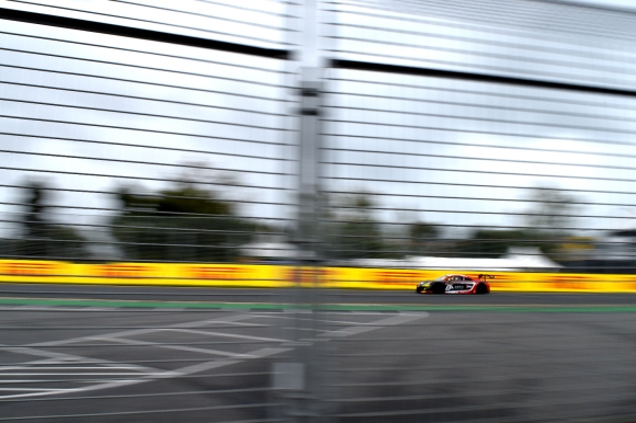

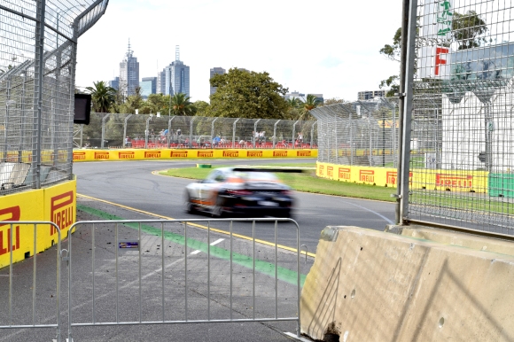 Porsche Carrera Cup, on approach to Turn 5


